Indie game storeFree gamesFun gamesHorror games
Game developmentAssetsComics
SalesBundles
Jobs
Tags

apiruxb

39
Posts
A member registered Aug 30, 2018

Recent community posts

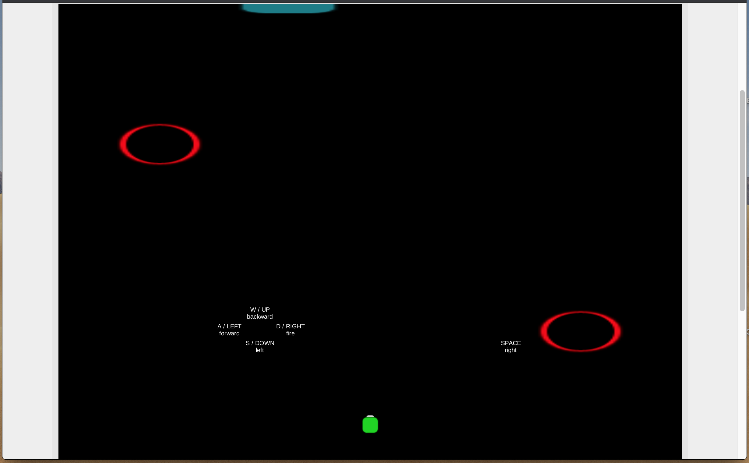
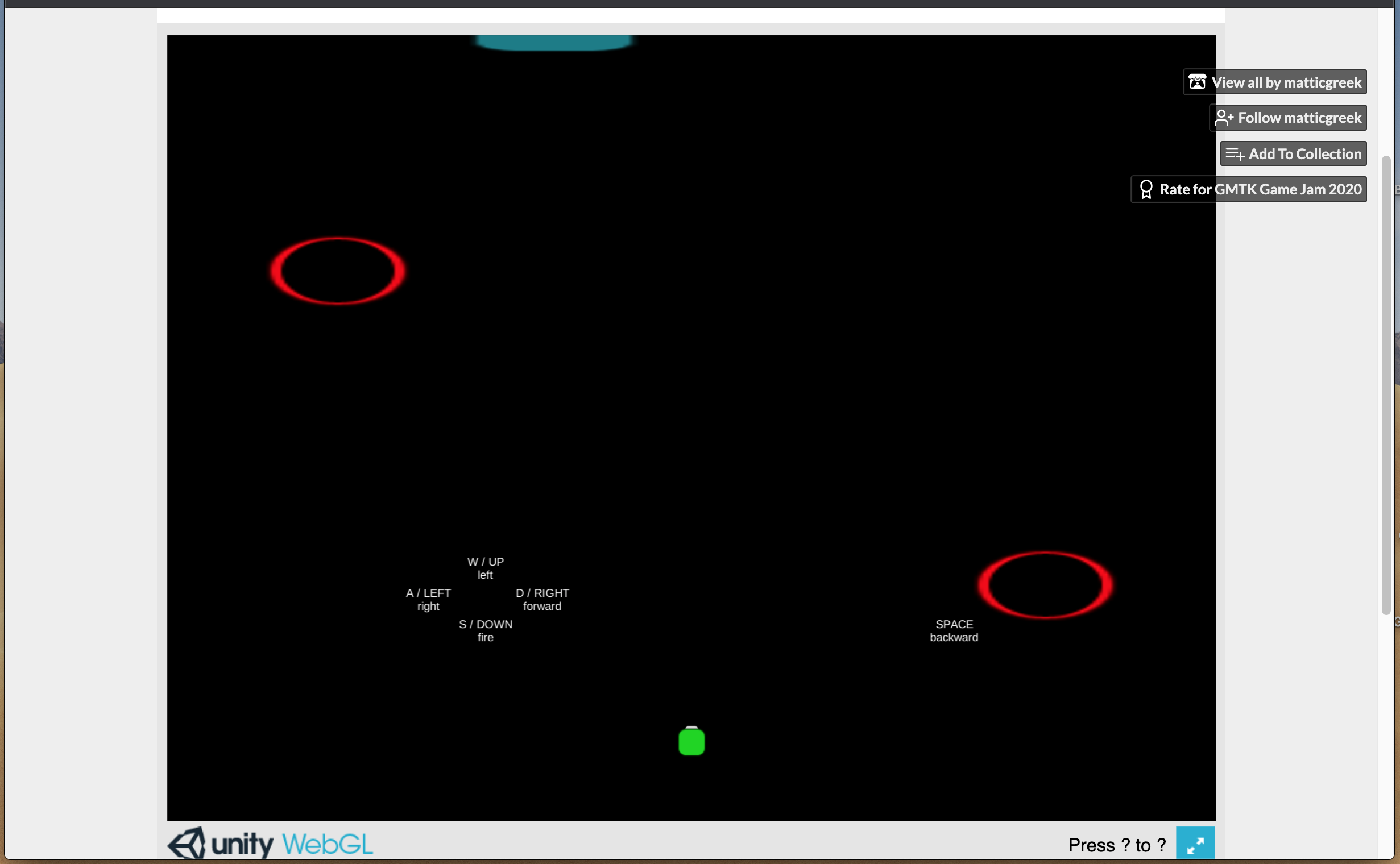
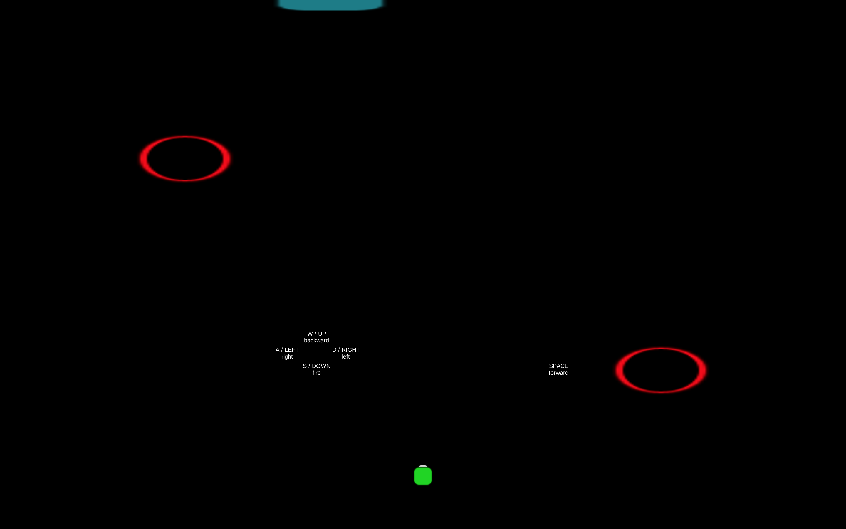
The mild eye strain was temporary and not so extreme as it may sound. It could be partly that my eyes were somewhat tired at the time as well. That said, I did have to get my face within a 1ft of the screen to be able to read it quickly enough. It might really be a display bug on the Mac as you said, though, since the texts did not seem to fit cleanly into the boundaries around them. Some sections’ text took up only a 1/10 of their spaces, and yet the customer dialogues actually seemed to extend to its edges. The fact that zooming doesn’t help also suggest so.

I’ve gone through my whole queue list +1 now (so 26 in total) and probably won’t be revisiting them for the time being. I’m also primarily on a Mac and don’t really feel like digging up my older Windows machine just to test one thing in a jam game. Perhaps someone with easy access to both can test for it?

In any case, putting aside the text display bug, I think it would still be better for “flow” purposes to have things be easy to process and act on. I understand the idea of making it feel a bit frenzied and hectic to be out of control, but I feel like making the UI and layout intuitive should still be a baseline. You have many other knobs to create the frenzy effect with here, and you’d probably prefer for the player to know exactly what to do but struggle to keep up vs. struggle to know what to do.

Plus, I personally believe that UX/UI should always be as intuitive as possible. Not to be confused with control scrambling gimmicks and visibility hindering vfx in some games, as those are actual gameplay elements in disguise. UX/UI is the player’s first direct contact point with the game, the channel of communication itself. The challenge should be within gamplay and game content rather than in the player’s ability to interact with the game to begin with. This is just my opinion on it, though.

All that said, as mentioned in the original comment, I do think this would have been fun for me if the UX/UI aspects were addressed. As you said, it’s not perfect, but it is a good showing. A lot of work went into this, implementation-wise and assets-wise. Having insufficient time to test and polish everything is kind of the nature of game jams to begin with. It’s part and parcel with the challenge, and you were able to clear it. You all absolutely should feel proud. Of course!

Ah, my mistake on the reference table then. My attention must have been too focussed on the play space. And yes, the strategic arson was an interesting design touch for sure. An undo button per se, but I didn’t get much use out of it since I hadn’t mastered the synergies anyway. Knowing that I can reference the table at any time changes that somewhat, though.

I can see how it is moving in more of a puzzle-y direction as you said. It seemed to be partly what you were experimenting with, but the time constraints probably limited how many puzzle-y features and mechanics you could layer on top of the base form if I had to guess. It would have been interesting if there were more “edit” tools at the player’s disposal in addition to strategic arson if going further in the puzzle direction. Perhaps game-y things that ignore real-world logic somewhat like swapping buildings or randomized building transformation, each with limited charges like with strategic arson.

P.S. Sorry for the delayed edit on the previous post. Had a phone call come in.

(2 edits)

Oh, I see. So you really can consistently score markedly higher if you master the synergies. That’s very interesting to know. In that case, I guess one thing that might have helped would be having a way to reference the synergies table at anytime from within the game (like a mouse-over icon in the corner or such).

I do find that city sim games actually feel somewhat similar to breeder games (i.e. Monster Rancher, etc.). The enjoyment is derived mostly from a mixture of mastery and customization, perhaps sprinkled with some joy of discovery throughout (i.e. secrets, surprising events, etc.) to keep things interesting later on. In those games, more than anyhing, I think he payoff comes through in the form of seeing your creation thrive and perform in context. For example, we watch the city run smoothly and read the “newspaper” in Sim City, and we watch people go on rides and get a periodic earnings report in Theme Park.

So going on that, if some “advanced” building types were reserved to be unlocked with progress and if the score was presented as a mix of contextually flavored performance metrics instead, then the feelings of gratification and reward could probably come through much more strongly. Perhaps going from a small town lot to a larger city space in the vein of level advancement could also help the player master the synergies in increments while feeling like a form of progress and reward in itself.

That said, the amount of work you managed to put into this in 48hrs of solo work is already quite surprising, so I’m not sure if you would have had the extra time for those additions. Still, as this was sort of an exploration of mechanics, I figure you might want to try that post-jam to see if it can bring the fun through anyway. If you do, I’m interested to give the updated form a spin if you could give me a heads-up.

I genuinely enjoyed this. It is a metagame type but one that targets the UI, requiring the player to go back and forth between the game space and the (perceived) UI space to solve the riddles. While metagame titles have been around for a good while already (at least as far back as The Tower, I believe), this one makes the ability to play itself the game. Yes, meta to the core.

I did rely on the Walkthrough for some bits, but the solutions I missed on my own did not seem too far of a reach. The fact that a walkthrough was included is greatly appreciated and shows that the devs really understand their game's relationship with the audience. And for me, the length of it felt just right as well.

The visual polish on this is great and is even incorporated into some of the riddles. Normally, I cap presentation scores at 3 stars if one of either art or audio used pre-existing assets, but I actually never got the audio to work. As such, I will just treat it as not having audio and score the art accordingly, with an extra bonus for incorporating graphical fidelity itself into the gameplay (it's faked, but the idea itself counts to me).

Ultimately, the best compliment I can pay it is that I did not play and review this as part of the obligatory 25 on the queue list. I was first intrigued and then became invested in the experience. The game caught and held my attention on its own. Great work!

(2 edits)

At its core, it's a pretty straightforward platformer, with the twist being that control keys are treated as a resource and also health. It comes together nicely, but it could probably be zoomed out a bit more. When the player is hopping on platforms higher up, the vertical visibility of the next platform or any spikes on the ground are very low, which creates unfair-feeling deaths sometimes.

To go by the 3Cs of the so-called Czerny Method, the character and controls are fine, but the camera is a bit problematic. With the fairly demanding timer chasing you and no checkpoints in between, the player must essentially either memorize the whole level or really master the controlling mechanic. If the latter is the designed expectation, then I would suggest spacing out the difficulty ramp-up a bit more. Otherwise, perhaps a bit more lenience on the timer or pick-ups that give some leeway (i.e. time stop, time extension, etc.) would help.

Also, letting the player know that Space = Jump from the start would be nice. I did not figure that out until about 5-6 deaths into the second stage, which requires it. I know that the first in-game sign says it, but I think it should either be made clear in the HUD itself or be included in the Menu's "?" button description. I read the "?" note before playing and then went straight ahead without reading the first sign. As the game does not pause the timer while you read (unlike the info boxes in Super Mario World).

On the one hand, I applaud the level design, which low-key teaches you as you go, including the spike pit at the start of the second level (ensures the player learns to jump). On the other hand, longer levels + low visibility + tricky spike placement + no checkpoint feels rather punishing at times. However, if this is meant as a kaizo platformer lite, then I suppose it is working as intended.

The polish and production come together well, but unfortunately the presentation score will not take those into account since they are pre-existing assets.

In all, a nice and balanced-feeling game (minus the camera) that successfully messes with player coordination as intended. Nice work!

P.S. There seems to be a collision/platform bug when the character hops onto the very edge of a platform at an awkward angle. They get pinned there, and the player must move in the opposite direction and make them drop (the only way). The character neither slips off or climbs on automatically, and they also cannot jump again to recover onto the platform.

It's very cute and complete presentation-wise, and the idea is interesting. However, to be able to apply any strategy, the player is somewhat required to learn the synergies between the different types of buildings. In the end, as there is a strong randomness component to building placement regardless, player agency gets nerfed at the point of execution anyway.

Personally, I only skimmed through the synergies and types of buildings and then started experimenting. After a few rounds, I found that the score would typically range between high 60s to low 80s, and whether or not I tried to be deliberate or just randomly placed them seemed to have little impact ultimately.

To call it what it is, it's an interesting little experiment, and the polish is very complete. I could be wrong, but I think you made this with more of an intention to explore odd gameplay avenues rather than with the goal of making it fun. The polish and consistent "flavor" of the game's tone does help sustain player attention on it for a while, despite the disconnect between player choices and actual agency (which is a consequence of the jam theme).

Perhaps a higher score can be semi-consistently attained if the player really masters the building synergies table, but the reward does not feel like it justifies the effort. Looking at the various components that went into this jam game, though, I can imagine you making a streamlined version of a Theme Park or Sim City inspired game if you wanted to (similarly to how Plants vs. Zombies is a streamlined tower defense game).

As I get the feeling that you are far better at prototyping than I am and also have all your design marbles together, there's really not much to say aside from describing the game experience I had. So I'll just leave it at that.

In all, I didnt' really have "fun" but do appreciate the work and intention that went into it. If nothing else, it does succeed in being experimental, and the polish feels very complete. Very nice work!

I meant to convey that the consequences of getting hit in terms of progression in particular was unclear to me. In my case, I thought the penalty for getting hit was that many pop-ups would respawn, thereby costing me progress rather than depleting a separate health stat. And in the midst of the frantic gameplay, I couldn’t quite split my mind to figure out what the speed-up criteria of the glitches were, which may mean that part is not very intuitive to the player.

That said, I’m going into these games with just a quick glance over controls and descriptions, partly as a way to gauge how well the game communicates or “introduces itself” to the player. I like how some games are able to just get the player going from the first moment and teach you via gameplay (i.e. Bastion, Super Mario Bros., Megaman X, etc.), and so I look for that. IMO, the burden of educating he player should mostly lie with the designer, not the player. It’s a high bar, but I do feel that it’s something significant to look for when it comes to game design.

And yes, as mentioned, apart from the minor gripes, I felt like your game was pretty much everything it needed to be. It has a clear identity and focusses on being exactly that. Being a one-time experience is perfectly fine. Stellar Smooch and Grow Cube are both very nice games that are like that as well. For this game, I also think it’s better for it.

This is rather impressive for a first jam, and even more so for a first game. I think most of us don’t even manage to finish on our first attempt. Please stick with it. Great job!

P.S. Now, for the love of Mark Brown, please... Have your pop-ups back. I don’t want them.

I think the platforming controls could have both W and Space be for jumping, but the more important fix is probably the physics and precision of the jump, coupled with possibly larger blocks to mitigate the ease of overshooting or slipping off after a jump. With those fixes, it would probably reach a good enough state to be mostly comfortable.

As for the copy-paste controls, no clicking might be good. The changes to couple it with would be an always-on tile highlight where the mouse cursor points and a separate visual indicator or cue when something is copied. Paste is visible on the spot, but Copy is visually harder to tell.

IMO, the multi-tile copy is probably best left out unless you plan to expand the game into a full sized one, where many more aspects and possibilities related to the core idea are explored. Not having it actually helps reinforce the trick in the last level, and you would also be trading clarity of controls for a minor convenience feature.

It is an attractive feature from an engineer’s perspective, as it feels like it should be part of the package of features. However, from a design and player experience angle, it would likely bring more confusion than convenience to the player unless they are given ample practice to get used to the basic form of the copy-paste feature first. In a larger game, though, there would be time & space to teach players from basic to advanced features via gameplay as they progress.

What I can somewhat extrapolate from your intention to “complete the feature set,” though, is that you probably either are or could be a very good software engineer. It’s related to the idea of a “quality gene” (as described by Chris Hecker and Jonathan Blow in a forum discussion). Just a fun little observation. Of course, this quality benefits game-dev and many other craftsmanship type fields as well.

For level design, Edmund Mcmillen (Super Meat Boy) has a nice bonus feature bit from Indie Game: The Movie, and Matt Thorson (Celeste) has a GDC Talk on the topic as well. Both can be found on YouTube, in case you’re interested.

The easiest way to describe it is probably as a frantic hybrid between Avoider and clicker games. I managed to win but still do not understand what the exact consequences of the glitches are in terms of progress. Plus, they seem to speed up after some condition is met (perhaps a timer after spawn or proximity to mouse?), but I am also unclear on that. For posterity, the way I won was by paying only mild attention to the glitches and focusing more on constantly & rapidly clicking while dragging the cursor around to close the pop-ups until I got down to just a few. Basically a button-mashing approach. I don't really understand how I won, to be honest.

The visual and contextual theming is well done. The overall aesthetic vibe leans on the cute side and reminded me of Beglitched on iOS. The game states and UX/UI are all there as well, menus and win screens and all. If the audio was not using pre-existing assets, I would have given the presentation 4 stars instead. Everything was very fitting, save for perhaps visual distinction of the glitches, which got a little hard to see in the clutter.

It's a cute message-in-a-bottle sort of game. It's the type you play once, appreciate the idea/motif, and are done. Not every game has to have great replayability or offer lengthy playtime. Some games, like this one, are mainly about executing the one punchline well. In that regard, I think it did pretty well (minus needing some balance tweaking perhaps).

Overall, a solid and very complete experience. I liked it well enough, as I prefer games that have a clear identity, and this one captured exactly what it intended to be. Good work, but I won't be playing again.

P.S. Now come and take your pop-ups away, please. They are like a relative's kids: cute initially but turn annoying from the first half-hour onwards.

(1 edit)

The idea is nice, but the level design and application of it are mostly uninspired here, the last level's trick being the only exception. There are likely many more ways to expand upon the core mechanic of copy-pasting tiles and 4th wall breaking, not to mention other game objects that can mix up the level and diversity of challenges. So on one hand, it feels like a missed opportunity. But on the other hand, there was a 48hr constraint in place, so it's understandable.

That said, the level design does fall short of its potential. It feels more like a single trick that happens across multiple levels. All levels before the final one basically have the same solution, but this seems to be intentionally to function as a setup to subvert player expectations in the final one. It works but is a little bit underwhelming. Still, a good idea is a good idea.

The controls do feel rather unintuitive at times. To clarify for posterity, Click->[CTRL, C] to copy but [CTRL, V]->Click to paste (note the order between mouse & keyboard inputs). Apart from that, the platforming physics are rather sharp and unforgiving, which is troublesome for the A-D-Space control scheme. A tip for future players on this is to "solve" the level in your mind first, then do all the copy-paste steps, and finally use 2 hands for the platforming. The character's jump can clear about 3 tiles high, just about, and it's quite easy to fall off the edges, given the small size of the tiles.

The art and music are functional, and the visuals do read clearly. However, as these are pre-existing assets, the presentation score is limited accordingly. Thank you for making the text a readable font-size, though. It seems to be an issue for about 50% of the games I've played in this jam thus far.

Overall, there is a seed of creativity here, but it's still barely a sapling. It could produce much more engaging results if expanded upon, but the present form currently only reaches the extent of a single good one-time trick. Good work completing a game project in 48hrs!

(1 edit)

I get the idea and vibe of the game. It's reminiscent of certain game flavors during the prime of SNES & PS1 era. As the devs have already acknowledged on their game page description, the game has some breaking bugs that have yet to be ironed out, given time constraints of the jam. I do wish there was a better way to go back to the title screen without refreshing the entire web page, though.

The art style and overall presentational vibe go a step in the direction of games like Hoshi de Hakken!! Tamagotchi on the PS1, and the music does have a sort of upbeat cuteness that one may recall from some older Japanese titles. I'm not sure if younger audiences will get it, but it's sort of a mood. So in this regard, I feel like it stands out and did really well.

However, another part of the presentation doesn't do as well: UX/UI. As the available controls are placed without backdrop or HUD borders at the top, overlapping the play area, it is initially confusing to tell them apart from the available pick-ups in the game area. Even after understanding this, the positioning and size of the HUD arrows often obscure the play area visually, despite existing for no other reason than to inform the player which directional buttons currently work. These should probably be isolated into a HUD area that is visually distinct and non-blocking, while the game-area pick-ups could probably use a shadow and hover motion (or some equally effective visual cue to indicate that they are pick-ups).

Additionally, there is no way to know what the rest of the map layout is like until the player gets there due to camera angle and proximity. This might have been fine for an action/adventure game, but it is a rather critical design flaw for a puzzle game. If the camera could zoom out for a broader view, either whole-stage or half-stage + save points, the player can avoid being punished for not knowing unknowable info (and having to re-execute the exact steps of an earlier section of the stage).

I'm assuming that spike behavior & kill-conditions have a critical bug in them, so I'll leave that alone and assume you'll fix it when there's time. Unfortunately, because they are game-breaking and progress-inhibiting (and combined with the gripes on the UX/UI), I was unable to enjoy the game properly. Without those issues, it would be up to level/puzzle design chops, but I expect that I would have given the fun factor 3-4 stars instead.

The base concept and direction are very promising, so I do hope the team continues development on it. Gameplay-wise, it remind me a bit of creative indie titles like Nova-111. I think it is a good mix and great start for what is perhaps a larger project.

Ultimately a solid entry that I would probably have scored an overall 4 stars if the bugs and UX/UI matters had not held it back. Please fix, and nice work!

It's a nice game, perhaps slightly reminiscent of Try Not To Fart on XBLA. The dialogue options are still fairly rudimentary, having some variation with the conversation never really straying from its linear path. However, this is understandable, given the time constraints in the jam.

The artwork is nice enough, especially with the small details like changing expressions and the small Lord of the Rings nod in the background, though the large screen resolution feels excessive for the style. And I did notice that there were sound effects, but perhaps they could be clearer as cues, split into 2 groups: drunkenness and date's approval.

And while high approval and low drunkenness is logically sound as the way to go, do keep in mind that this is a game. It would be good to convey a bit more clearly that the objective is the maximize approval and minimize alcohol levels, as it could be misunderstood that the alcohol level simply affects the interface behavior and not the ultimate evaluation (at least until after 1 playthrough). I can also imagine an alternate evaluation criteria, where the player must try to get both scores up in a sort of "get drunk and get away with it" kind of joke motif.

In all, though, the game does have a good bit of each component one would expect in a complete game all around, making for a solid entry. Good work!

(1 edit)

The idea is interesting and in line with the jam's theme, but units switching allegiance based purely on randomness makes performance mostly up to RNG despite of being a tactics/strategy style game. Perhaps had there been more time, better criteria could be set for units switching sides. RNG can be a factor, certainly, but it's a bit much if it is the only factor. Also, tactical/strategic implications are mostly moot when the units are all set in a confined cluster, as player choice just boils down to doing what's available from RNG each turn.

Key-based controls feel a bit unintuitive compared to mouse or controller here, and it took a while to figure out exactly the sequence of confirmation inputs for some of the actions. For the UX/UI, a tile-range highlighting display a la Fire Emblem games to show movement and attack range would have been nice as well, especially with archers not being able to shoot over allies to land ranged hits against distant enemies.

The core gist of the idea is interesting and could lead to some inspired mechanics and emergent gameplay, but the execution on it here falls short of that. That said, to capitalize on more promising possibilities with the idea would probably require more time and resources than the jam constraints are friendly to.

The art and sound effects are nice, and the BGM suits this type of game and setting. Unfortunately, I can't really give a higher presentation score, seeing as these are pre-existing assets.

In all, a valiant attempt at something new and different, but this iteration kind of misses the mark. Good job completing a game project in 48hrs, and good luck iterating if you decide to explore the core idea further.

P.S. The restart menu that comes up at the end of a game doesn't seem to respond to either mouse or keyboard inputs for me. Not sure if it's a bug, or perhaps I'm missing something.

(1 edit)

^ I've responded to both issues in the comment thread further above that you mentioned.

Okay, I've revisited it and found that the blue gate is in the display (at the edge), but the Unity player on for this game is exceeds the height of my browser's visible display. It can be mitigated via the web browser's zoom-out (Cmd -) and scrolling. I'm playing on Chrome web browser on an MBP 15".

I've taken 3 screenshots for your reference: in-browser as is, in-browser zoomed-out, and full-screen Unity Player. The text's font size & displacement from the intended position can be observed here, too. Note, however, that the control-text being closer to the center of the screen in this case makes them much easier to glance at compared to being at the bottom corners as intended (though I personally would prefer a cluster at the top-right, where HUD stuff is often placed).

[ As Is ]

[ Zoomed Out ]

[ Full Screen ]

Hope that helps.
(Please excuse the size.)

That’s totally understandable. It’s a game jam after all. That said, I did beat it, so the listed detractors were not so bad that I quit halfway. My intentions were to provide actionable feedback, not to complain. It’s a 48hr game jam, so finishing a playable game in time at all is already plenty compliment-worthy IMO.

(2 edits)

I see. In that case, you might want to consider ways to make the consequence of actions more deterministic and consistent. Skill-based games need to reward mastery, and mastery is generally accumulated via the degree of comprehension and amount of practice. So more often than not, precision of execution is demanded of the player in such games. To make that feel fair (yes, even in single-player experiences), the game’s action->consequence outcomes need to also be precise and predictable.

If you were to add a “straighten out” action with a cooldown, where all resting blocks would be snapped into the nearest orthogonal grid alignment, then it could produce a mix of “creation is messy” and “refactor!” combo. Or auto-snap upon the block settling (post physics) could also work, just to list a couple options. If piling high is kept as the goal, then gapless lines can be rewarded with either a perk (i.e. get a special piece next, charge up grid-snap meter faster, prevent interference, etc.) or an interference to the opponent (i.e. raise water level, knock out a random piece on opponent’s side, stop time only on opponent’s side, etc.). Some of these could create emergent gameplay scenarios where moving your own block to the other player’s side might be (rarely) beneficial as well, if you decide to continue to allow cross-side placement.

The key is probably how to make player intention translate well to consequences. Execution precision is important in skill-based games, yes, but player intent still has to have more agency than external factors that feel outside of player control. The reason why games like Gang Beasts works well is because they deliberately parody this aspect for hilarity. And yet, even so, they actually sustain a very fine balance between what is in control (player controls) and what is out of control (ragdoll physics) in that game. Similar things can be said of Getting Over It (@#$% ^&*, Bennet Foddy) as well.

I do believe you can take it either way between skill-driven physics game vs. parodic party game, or maybe even a sort of balance like Gang Beasts. Good luck with whichever direction you decide on.

P.S. Credit where it’s due. The random objects idea isn’t mine but rather from having seen this legendary video: https://youtu.be/gZmnLe0EcXM

(1 edit)

It's certainly a novel spin on Tetris, though I'm not sure I would actually consider it a Tetris variant outside of the piece shapes. The goal to stack things high rather than form complete & gapless lines kind of runs counter to the core concept of Tetris. Perhaps it would be more fitting to push the ridiculousness further and go full throttle in the parody direction, throwing in occasional non-block prop items like fish, seaweed, and chili peppers (that may roughly resemble Tetris block shapes but are slap-stick obviously not).

As others have also mentioned, the pace feels too slow. Either increasing the speed or the size of the pieces would probably remedy (or at least mitigate) this, though. The cement block is an interesting idea, and perhaps the game could add some other variant blocks to mix it up further if development continues.

Presentation-wise, the game is quite polished and has a good number of assets at that level of polish. Sound effects and BGM are actually nice but grow irritating due to the length of a round and its slow pace. That said, the lack of interactive diversity makes it feel rather bland and somewhat like a physics demo in a way. Despite the production value being there, I did not really "feel" much of anything while playing (apart from "physics is working"). If only it felt like more was happening, I would probably have liked to give the presentation 4 stars.

That said, it certainly is a very solid implementation of a novel idea. I didn't really "have fun" playing, but credit is due to the willingness to explore eccentric gameplay avenues. So kudos to that.

Overall, quite forgettable but also equally novel. Good show!

It's very polished in terms of production and presentation. I would have given the presentation 5 stars had the audio not been pre-existing assets. The little bit of homage to Flappy Bird was nice, by the way.

The core idea and mechanics work very well, but the hero of the show is the level design ideas and layout, which do an excellent job of showcasing both the consequences and the possibilities of the core mechanic. That being said, the placement and spacing in many levels are very rigid, especially since aiming is a bit tough to gauge (and collision is not that forgiving either).

I would have given the fun factor 4 stars if not for the inability to understand how the ball's momentum works, in the face of the tight-rope precision the game demands. While I can somewhat get over the trajectory being a bit tough to gauge sometimes, the momentum and acceleration feel a bit erratic at its limits. When a level's solution/nugget requires precise execution, this feels rather unfair or at least poorly conveyed. When the level's spacing and placements are not so strict, however, this is a mild matter and is barely noticeable.

Since the level designs are inspired and have a puzzle-y nature to them, the strict execution fights against it. When the player reaches the correct solution in their mind but has to retry >50 times due to stringent execution precision, those next 50+ attempts simply become undue punishment. Fix this, and the game experience overall could probably have a proper price tag on a storefront, given enough content and if the level design remains just as inspired throughout.

Gripes and compliments aside, it's also worth noting that the core idea itself can probably be explored further. For instance, there could be other game objects in the level aside from walls and button-recharges. Look no further than Pinball and The Incredible Machine games for inspiration on this. Then again, perhaps I simply did not get far enough to encounter them (stopped at level 8 due to the momentum factor).

In all a great entry, and I certainly hope it gets taken further. The potential is certainly there. Great work!

(2 edits)

A solid showing. Has a good bit of every component needed in a complete game plus some creative tricks here and there that mix it up. The core idea itself works, and the way it is tied to the narrative setting is a very nice touch. The presented applications of the idea, however, do feel a bit limited when compared to its possibility space, but this is probably due to the time constraints of the jam.

A minor bug occurs in the last scenario if the player holds down move-buttons while re-spawning from death, where the re-spawning invincibility state is sustained, allowing the player to push the other bots around. Apart from that small fix, perhaps a sound effect or two could be nice.

The idea has a broader possibility space than this, so it would be nice if the team explores the idea further beyond the jam. Some aspects of the game idea and setting are a little reminiscent of Portal, which similarly began as an interesting idea with broad possibility space (as the student project Narbacular Drop) and took it further.

It's still just scratching the surface, but nice work all around. It's quite a lot to have completed in 48hrs. Great job!

Firstly, nice artwork. I would have liked to give a higher presentation score, but the text size requiring me to bring my face within <1ft of the screen (15" MBP) to read it is a major detractor to the UX/UI. This is more so since there was sufficient space for a larger font-size in every place that needed it. The game does require some reading of the UI, so those extra pts to font size were expected and needed, especially with a stylized font like the one chosen.

I'm not sure if it was a display bug, but I did try to read it and gave it an honest go but couldn't get very far into gameplay before minor eye strain set in. I played it on Chrome web browser on a Mac, and using the browser's zoom-in (Cmd +) feature didn't remedy this.

As for the gameplay, I think it could have been fun had I been able to read the text and engage it in earnest. From what I can tell, it is a simplified spin on recipe-execution gameplay a la Diner Dash or Overcooked. The customer departure speeds are very fast, but this factor is what enables the game to be in line with the jam theme. The flavor text could probably be reduced to shorts blurbs instead, so as to not distract from the elements with more gameplay significance.

One key criticism would be that much of the extra screen space populated with visual flourish could be instead used to convey some of the necessary information visually. For instance, rather than props in the background in the center fo the screen, the recipe could be shown visually with art and symbols there instead. This would make the essential game elements clear, front & center. Currently, it is difficult to tell apart FG from BG, gameplay elements from from decor, and HUD from game environment.

In all, it has an idea that works and enough art to go around, but the UX/UI flaws make it pretty unplayable for me. Still, clearly a good deal of effort went into making this, and that is certainly deserving of recognition.

Good work completing a game project in 48hrs, especially for the 2 (of 3) who are doing a game jam for the first time. Kudos on finishing on your time!

Pretty simple and straightforward gameplay: dodge projectiles (bullet hell style). Upon starting, the directional controls are randomly swapped. There's not much to be said apart from that, but it works as intended.

The sprite and music are kind of cute, but the score on that is limited by the fact that pre-existing assets were used. Notably, inclusion of title/menu screens in all of the key game states deserves credit and acknowledgement.

In all, a simple game with a small twist that works. Good work completing a game project in 48hrs.

(1 edit)

The setting is cute & geeky, and the wonky-movement mechanics work. However, it's the combination of level design and selection of objects/hazards that really make the game.

That said, as the devs have acknowledged, the game is buggy in many ways. The controls have multiple bugs, including inconsistent angle determination and sometimes not recognizing input (might be a state-machine bug actually). And the bounce sometimes inverts the L-R direction on the 'dx' of the character. Some of it may be intentional, but the fact that the player cannot tell what is and isn't intentionally "out of control" in that regard makes each thing feel like a bug every time. And in a physics-based platformer, control & physics bugs are just about the worse types.

In terms of presentation, on the other hand, there is a lot of lovability and small details added in. Personally, I feel like these count, as they play a major part in helping the player view the character as a clumsy-but-cute hero of the story trying its best rather than just a bundle of frustration. They set up expectations properly. And the music is also perfectly on point. If nitpicking, the background feels rather bare.

It took some extra time and frustration to beat due to the bugs, but I believe it would otherwise have been quite fun. Nice work, and good luck fixing the bugs.

(1 edit)

On one hand, I think the perpendicular movement cheesing technique requires a bit of understanding of orbital behavior & the firing trajectory overall. On the other hand, this alone probably should not allow full-game cheesing.

Perhaps placing a bumper object that can rebound bullets based on collision angle in later levels could help resolve this somewhat. I do think understanding orbital behavior should be the key to player success in this game, though. So to an extent, if the player can figure out how to orient their movement & shot angle from a preferred starting point to cheese, that could itself be the point the game makes. I’d probably increment up to 2-3 bumpers at max if you decide to do this, as any arcade-y difficulty introduced this way would also reduce spotlight on the core identity of the game.

Just to confirm about font size, it was small when I played it as well (in web browser on MBP 15”). My screen as a whole was enough to make out the text, but I did feel inclined to lean in to read it sometimes.

+1 on the resolution issue.

Before seeing this comment, I had no idea there was a blue gate at all. It wasn’t in the visible area when I played it (in web browser on  MBP 15”).

(3 edits)

Firstly, I'll clarify for posterity:
1. There is a fixed number of "control turns," and you'll run out of control upon using them up.
2. When you run out of control turns, the character moves on its own with a simple A.I. (that can also jump, unlike your manual control).
3. The 2 ways to win are (a) manually get the coin & flag while in control or (b) set the orientation up correctly on the exact turn you run out of control to allow the A.I. to succeed.

Once you figure it out, it becomes a cute and fairly engaging puzzle game. Quite clever, but it needs better descriptions or a starting demonstration/tutorial to convey the core mechanic of intentionally running out of control. If I hadn't stumbled upon the mechanism while trying out different levels at random, I would have thought it was all a buggy implementation. Fortunately, I discovered the mechanic (by chance, mind you) because the game was quite fun once I did.

The puzzles are well done. Going through them in sequence, some help introduce new mechanisms (subtly), while a few others feature puzzle designs that subvert your expectations. And for the record, I beat it. So yes, all levels have a valid solution.

In addition to properly teaching the player the main mechanic, it could use some more levels and perhaps an easter egg or two. But overall, it's a very good showing with a good mix & balance of elements. ...And yes, it is very cute. Cheers to the devs!

Good work.

Stick with it. It's a good start. You finished the project in time for submission!

Regarding the teleportation, if it is intentional, you'll want to add in some visual/audio cues to convey that to the player. As a baseline, if the player can't understand it, then they aren't experiencing your game. Behavior that isn't recognized as a feature will feel like a bug.

ASMR x Fidget Toy fused into a game reminiscent of Windowsill. Who would have thunk it.

Simple and essential, it is not much, but it is everything it should be. Admittedly, as partial to ASMR and Windowsill-nostalgic gameplay, it is rather short on variety, which removes arguably the biggest charm of games like Windowsill: the joy of discovery. Still, a good showing and nice production polish.

The best compliment I can give this game is probably that "it feels tactile" even though I'm using a mouse. It reaches a bit further than skeuomorphism in that regard, which is certainly an impressive feat in terms of UX/UI. Very nice work.

If it had some easter eggs, hidden bits & nuances, or even just one additional sound cue to randomly disrupt the mundane cadence that sets in after a while, then it could be much more enriching. That said, this is a very solid showing.

Great work, and thanks for the little bit of ASMR where I least expected it.

The base idea is bound to be fun in an arcade-y manner, but unfortunately there are many bugs and imbalances in it to really achieve its due effect. The need to touch the thing shooting at you behind a wave of obstacles should some good tension if/when implemented well.

A short list of critical things to address:
+ ice spheres speed up too much after the player crosses half-screen (vs. player speed)
+ collision detection between player sprite and bullets are off (can hit despite a large gap)
+ there is a bug that makes the player sprite teleport/jump a short distance (no idea why)

This seems like an entry that is from someone still getting over the learning curve of their tool/software of choice. We've all been there with various tools/software at some point, and many of us still are. So keeping that in mind, good work on completing a game project in 48hrs.

Keep at it, and good luck in future jams/projects.

There's a bit of a learning curve for the controls when on the kill pill, but the contrast in that is what puts it in line with the theme of the jam. The gap in intuitiveness between the 2 control schemes make for a good focal point in the game's mechanics.

If this concept is explored further and becomes more refined in either gameplay depth or synesthetic sense of feedback & controls, I think it could result in a sort of hi-fi arcade-y experience. Something reminiscent of Geometry Wars perhaps, which itself could probably be described as Asteroids evolved. The idea has potential and a good direction.

Unfortunately, I played it on a keyboard, which is not the preferred control medium for sure. It would do great with the combination of an analog stick and a pair of L-R shoulder/trigger buttons. With that, improved level design, and production polish, this will become a haptic treat. Kudos on finding a strong core concept & mechanic.

The art style and audio are both headed in a good direction. That said, the visual polish is still a bit short, if I'm being picky.

I hope you take it further. Nice work!

Thematically relevant, but also perhaps the more obvious idea. Mechanically speaking, it doesn't stray very far from spraying bullets for the most part, though the uphill fight against contagion was a good twist. On the whole, the package comes together for a good balance, and it feels like it is exactly what it needed to be.

I think the more intuitive control choice would be to have right click simply be use of the mask. In implementation, it could just prioritize which button was either pressed first or pressed last when both are held down. Apart from that, it controlled very smoothly.

The sick-emoticon was a cute touch, and all the visuals read well on screen, even when moving quickly. The music was fitting and gave a matching vibe as well. So nice choices there. I wish I could give a higher score for polish & production, but that's limited by the fact that they are pre-existing assets.

Solid execution. It plays well and was fun overall. Good work!

It's a very novel idea. I've not seen gameplay that is centered around orbital trajectories. The closest thing I've come across is probably Geometry Wars 3 or Sonic: Lost World. Great job coming up with that and successfully executing on it.

There is a surprising amount of polish for a jam game here. A clearer feedback cue on bullets hitting the statue would be nice, though. And perhaps if the light source could move a bit over time, that would be nice for the darker sides of the planet, unless that was intended.

The bullet trails were very well done and really sold the orbital component. I like how they result in a gradiated streak and have just a touch of randomness to make them feel less mechanical. I do think that they were the most essential in this game's visual feedback, and they seem to have received dev attention proportional to that. Good call.

If anything was lacking, I suppose the "juice" in the payoff falls a bit short of the rest of the game. If it could convey some gratuity upon hitting statues or clearing a level, that would be great. As it is, it is incredibly polished in most aspects but doesn't feel very rewarding.

In all, a great entry. Though it was just the essential gameplay without further complexity, but each component played its role well. Kept my interest for a little while. Great job!

Cute sprites but could use a bit more in terms of visual feedback when shots hit (i.e. blinking sprite, sound fx, etc.). Never saw the werewolf form, but perhaps I just didn't last long enough. Only got to around 30+ pts and picked up one of the power-ups. Or maybe it wasn't implemented in time for the jam deadline, which would be understandable.

Notably, though, under More Information on the game page, it shows that it was posted for Ludum Dare 46 previously.  Is there some kind of mistake? Or a re-submission to a different jam since themes supposedly match?

I'm not too sure what's going on there, so I'll leave it at that. Good work on making a game in 48hrs (or 72hrs if you did the 3-day stretch for LD46).

It seems like a last-minute submission, so I'm assuming that is the reason why there are no descriptions on game objectives or win conditions.

The changing controls on a timer is a nice spin. It would have been nice if there were more consequences and gameplay interactions to give that spin more of a weight or impact on the experience.

A good idea, but the gameplay needs some consequential interactions and feedback cues. Nice job completing a game project in 48hrs.

(1 edit)

I personally find indirect or limited controls to be good creative constraints, so it's nice to see people experimenting with them. In this case, however, either they need some fine-tuning for efficiency or should probably involve a more advanced consequence.

For efficiency, player movement is slow and the effect of the burp is very minor, making the majority of play time about the chore of slowly moving things. If the movement speed & effectiveness was greater, or if the board was smaller, player intent would translate to gameplay action better and produce less idle time.

Alternatively, advancing the consequence of the burp to full commands (but with no control over the specifics) might have allowed things to proceed faster as well. For instance, if the burp assigns an objective (i.e. seek & destroy vs. flee) or nature of behavior (i.e. move forward, turn around, etc.), then the number of player actions required per gameplay consequence (i.e. combat, falling off edges, etc.) could be reversed.

Also, why CTRL key? Is it because of the theme in a literal sense? A slightly funny nod, certainly. But as an ergonomically inclined citizen of the Internet, allow me to put this bluntly: #$%@ ^&*!

Since pre-existing assets were used, I can't really give a higher score for that aspect.

In any case, a nice attempt at exploring unorthodox controls. Good work completing a game project in 48hrs!

(1 edit)

Plays quite intuitively, with the un-wieldy controls being intentional and in line with the theme. Incrementing difficulty (rabbit spawns) and having variation in the kill moments (slow-mo) were nice presentation touches.

On one hand, the mechanics do not feel so innovative, but it also makes it easy to understand. I like that some attention was given to mixing things up in each aspect of the game, giving it a bit more personality & "juice."

Seems a solid case of keep-it-simple & polish. Nice work!

I'm not sure I understood the controls or gameplay objective. I played 1 round, where I killed an enemy and waited a bit longer than expected for a new enemy to spawn before dying to it. The jump did not give enough elevation to go anywhere from what I could figure, and the attack often comes out in a different direction than clicked (if this was intended, it did not convey it very well).

I would have given a higher score for the presentation on account of the art & audio inclusion, but it's also also from pre-existing assets.

In the end, I couldn't quite get into it, but good work completing a game project in 48hrs!

An interesting idea that could lead to more engaging gameplay consequences with some more time to work on it. In its present form, the gameplay starts at a surface level and more or less stays there. Still, good work on completing a game project in 48hrs!

The base idea for the UI was intuitive, but the mini-view of progress bars on each aspect could be shown next to their tabs instead of requiring a mouse over. That way, the understanding of each decision affecting multiple fronts would be easier to recognize.

There were also a lot of typos, which is not game-breaking, but it is the kind of thing that can be a bit irritating for some of us at that frequency. This is especially so when the game relies on text descriptions to convey most of its flavor and context.

I didn't have that much fun, but I did play through to the end. Nice work!